Sunday, October 02, 2005

'One Sentence' Comic Reviews

Bit of a running joke with my office mate these, so here goes:

I'm an absolute nobody in the world of comics so none
of this means crap all, but we all have opinions, likes and
dislikes. Either way, this past year or so I have really grown
to appreciate the huge amount of work and love that goes
into these things....and I seem to be buying more.

'Transmetroplolitan:back on the street'
by Warren Ellis, Darick Robertson
Great stuff, wasn't sure about the art at first but it was a 'grower',
reminded me of 2000AD from years back'


'Identity Crisis'
by Brad Meltzer, Rags Morales
Really engaging and well written, never expected to give a crap
about 'Elongated Man', Art kinda trad 'comic booky' but still cool.


'B.P.R.D: The Dead'
by Mike Mignola, John Arcudi, Guy Davis
Ok..if a bit incoherant with two unrelated story threads, I just wish
Mignola himself was still doing the art, tough shoes to fill
for anybody.


'Batman Faces'
by Matt Wagner
Short but neat story, really enjoyed the pace and 'simplicity'
of the art.


'Superman & Batman: Generations'
by John Byrne
Not really my usual cuppa being such an 'out there' soap opera
story, but I enjoyed the traditional comic book visuals more than
I expected.


'Batman deathblow'
by Brian Azzarello, Lee Bermejo
Story is cool and the art is dark, gritty in your face stuff, didn't like
the 're-design' of Batmans costume though.


'The Moth'
by Steve Rude
Great fun pulpy 'phantom' kinda stuff, retro art perfectly
compliments the 'hero lives in a circus' groove.


'The Pulse: Secret War'
by Brian Michael Bendis, Brent Anderson, Michael Lark
Having been a huge Bendis fan for a long time, I feel bad I'm losing
interest, but this book feels more like an excuse for a crossover
than a story.


'The Originals'
by Dave Gibbons
Ok..Quadrophenia with hover bikes, but the visuals felt kinda
too 'friendly'.


Selina's Big Score'
by Darwyn Cooke
Terrific all round... how anybody can draw such beautiful faces with
half a dozen brush stokes I just have no idea.
Champion Pinup Number 3

ronnie_pinup

My errant child of a MAC will not let me have the No2 Pinup
right now, so here is number 3.
The Champion as depicted by the hugely talented

Ronnie Del Carmen
www.ronniedelcarmen.com

Aside from being annoyingly good, a seemingly effortless
draughtsman and all round 'story Yoda'. Ronnie is the creator
of 'Paper Biscuit' which to me seems just about the cleverest
excuse around to draw pretty girls.

The dog ate my homework

Bloody hell its October all ready!
So much for Mr "Post More Regularly"
So..I was all set to upload another of the nifty pinups
that my talented pals did for the Champion but....

Despite working for Pixar and supposedly being a 'Computer Guy',
the last month has been just painful due to my misbehaving MAC.
This time the backup drive that contains my copy of the Champion
is refusing to giving me any files... jees, you'd think I'd purchased
HAL two years ago.

News wise, since that last post I've been busy in my spare time doing
a Batman cover for DC Comics!!...yep, you heard right, my first 'pro'
comic job :-) An especially rewarding task for me as I'm quite a fan
of the character. It was very cool to get an opportunity to do ones
personal 'take' on something quite so iconic.
Though I hadn't drawn Batman since my teens, felt kinda naughty.

I had been approached by DC's Mark Chiarello back at San Diego Con
(check out his beautiful Batman:The Devil's Workshop)
after a few emails and a bunch of thumbnail ideas, he chose one of
the designs and suddenly I had a commision...

Despite a really good attempt on my MAC's part to screw up all the
files on my drive, I managed to complete and turn in the final image
just the other week. (credit to local MAC meister, Dr Terry)
I can't imagine any editor wishes to hear "er.. my computer crashed"
from a first time cover artist. Though it's often quite a legitimate
excuse back at Pixar...

I shall ask the nice folks at DC if I may put anything related up here,
perhaps at least the rejected thumbnails if my MAC lets me have
them back. Not sure when or how the 'final' will make it to the
stands, I'll post details when I have them.

and yeah...every post should have a picture


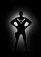
This was a previous incarnation
of 'The Champion' from 2004

Saturday, September 03, 2005

Champion Pinup Number 1

Now the book's out its time to share these...


This one is by the annoyingly talented Steve Purcell

Steve is of course the twisted genius behind 'Sam and Max'.
Yes, I mean that brilliant Comic / Computer Game / Animated
Series from the mid-nineties.

check these out:
www.spudvision.com
www.samandmax.net

Pulp Fiction


another something of mine from the book...

Very Very Late Con Photos


After being a bit slack with the postings I finally got around to
uploading some Comic Con photos. Including the obligatory
'Girl in Leia Slave Outfit' shot.

Thats my drunken face top right, in a white 'Champion' T Shirt
..I still have some in White or Black for sale :-)

Since Con, I've had a long lazy break, so now its back to work.
Not only am I planning whats next for the Champion but in the
short term I also have a neat commision, perhaps more about
that later.

Those E-Ville Boys are on the Case already with a new 'Afterworks'
site and a nifty internet sales thingy is in the pipeline.

Monday, July 18, 2005

'Stormtrooper Elvis' has left the building


Holy Crap.....so that's Comic Con!!
it was pretty intense, a packed explosion of noise and colour!
Now I really need to sleep and re-hydrate!

A quickie post..and yeah, every post needs some kind of image.
as I won't have a chance to upload Con Photos right now, I'm off for
a quick holiday, I'm sure the E-Ville chaps will stick a few up.

Thanks very much to all you folks who came over to see us at
our table, even more so if you bought books :-)

And cheers for all your support and encouragement, its means so
much to know that there are folks out there that enjoy our personal
work....in addition to Pixar's :-)

Monday, July 11, 2005

one more thing...


Some folks have been asking me about how/where to get the stuff

Right now items will be available at San Diego Comic Con
http://www.comic-con.org/index.php

for me that includes:
'Afterworks' The E-Ville anthology containing "Champion: Chapter 1"
Champion T Shirts (varying sizes, Black White, Grey)
A few 8" by 10" Champion prints
Champion Flyers

frankly, merchandise is at least as much fun as making the comic :-)
so I may do more in the future..I've been testing out 20" by 30" photo
posters with exciting results

Anyhow, when the dust settles from San Diego. I'm sure we (E-Ville)
will be putting something in place for online sales
Do hang on in the meantime, I really appreciate the interest.

cheers
Simon

Saturday, July 09, 2005

Blimey! Comic-Con is nearly upon us


Being a 'Con Virgin', I'm especially excited to actually be an
exhibitor for my first visit!. Those few who've seen 'Afterworks'
so far seem to like it a bunch, which is great.
Pixar folks will get a full preview on Monday. Thats quite a
daunting 'jury of peers' !!! :-)
Then its time to chuck everything in the van and make our way
down South. We set up on Wednesday, enjoy preview night, then
have a drink or three.

I expect this will be my last post prior to the Con as I'll be
scrambling around Mon/Tues getting my act together .
Including picking up the T Shirts (now in Black, White and Grey!!)

Its kinda fun the web stuff, so I will pick it back up in a few
weeks, after Con and a short break in Europe.

So, thanks very much for checking out the site, it really is much
appreciated. Hope to see you in person in sunny San Diego.

I'll be the one in black with the specs and British accent :-)

cheers
Simon

Tuesday, July 05, 2005

How much more black could it be?


A couple of other pages from the story. Not in order.


Just in case you were wondering, I didn't actually make a mess of
the black levels on the top page:-)
(though I easily could have, whilst working 'non-calibrated')

Since the story covers two time periods. The 'Flashback' stuff
(above) was designed to go to a 'not quite black', to resemble
a projected image. Whereas the 'present' drops to a full black,
thus also making the widescreen panels less defined on those
particular pages.

Ok..here on the site it seems a little odd,
but it works ..I think..in the context of the book:-)

Saturday, July 02, 2005

Is that a 1930's Ipod ?


Controls for one of the Champion's devices. (render of a 3D model)

I was inspired by the amusing simplicity of the device used
in the 'King of the Rocket Men'. Jeff King's flight controls being
limited to dials indicating up or down, fast or slow.

Maria


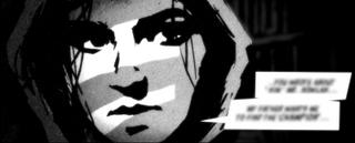
Though not referred to by name in the story, I had
intended the girl to be called 'Maria'.

It was her that I grew to dislike the most during the Artwork :-)

You see, having commited to this particular style, especially with
those blacks in the eye area, it was always a big fight to not have
her look like Robert Smith (...that guy from 'the Cure').

I hated this particular panel for weeks, it took me about
8 versions until I was happy... patience and good reference
was the eventual solution.

now it's one of my favourites...funny that.

To be continued...

Actually started writing the next 'Champion' storyline today.
I can promise Robots...

Is it a bird?


Again, derived from early tests, I wanted to mimic a kind of old
publicity still. The 'Photograph' itself actually a combination of
3D Render out of Maya and 2D painting in Photoshop.

Pin-ups Teaser

I was lucky enough to have the following Artist buddy's
do me their own take on 'The Champion':

Left to Right:
Steve Purcell
Ryan Church
Bill Presing
Ronnie Del Carmen


They are all amazing at full size !!
I shrunk them down pretty heavily here so as not to
spoil the effect of seeing them reproduced in the book.

Thanks Gents :-)

El Chrono

Having been literally blown away by El Nino in L.A. 1998.

When I wanted to come up with a name for a phenomena
that might conjur up a T.Rex, a Time Storm perhaps...
The name 'El Chrono' was the obvious choice.


This is also the segment where we briefly meet 'Betty'.
She is designed to evoke a 'Dale Arden' as drawn by Alex Raymond.

Comments

So.. the obligatory Blog Comments section is an odd thing
Who am I to presume anybody is interested enough in what
I do, to actually desire to make comments?

Now I'm new to this, but If I am going to do a 'Blog' and with
presumably relatively little incidental traffic then I may be
essentially talking to myself, ranting like that mad chap on
a San Francisco bus.

And if there is absolutely nobody listening, there's just a tiny part
of me that would rather not know it... :-)
So I shall remove that rather presumtious 'Comments box' on posts
from now on, unless...

unless hundreds of you object of course....ha ha ha
no I mean it......anybody?.... Bueller?....